안집 7525
-
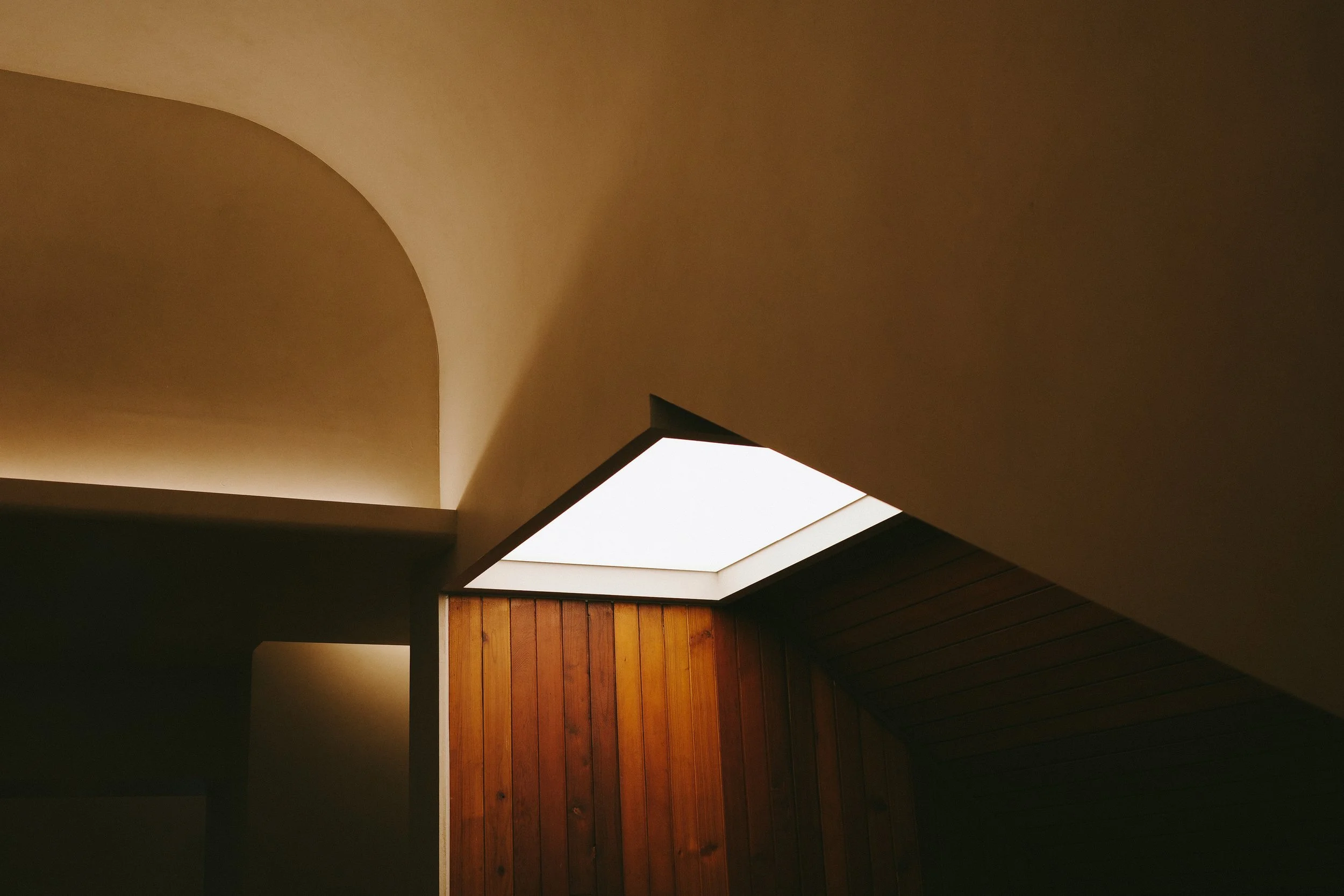
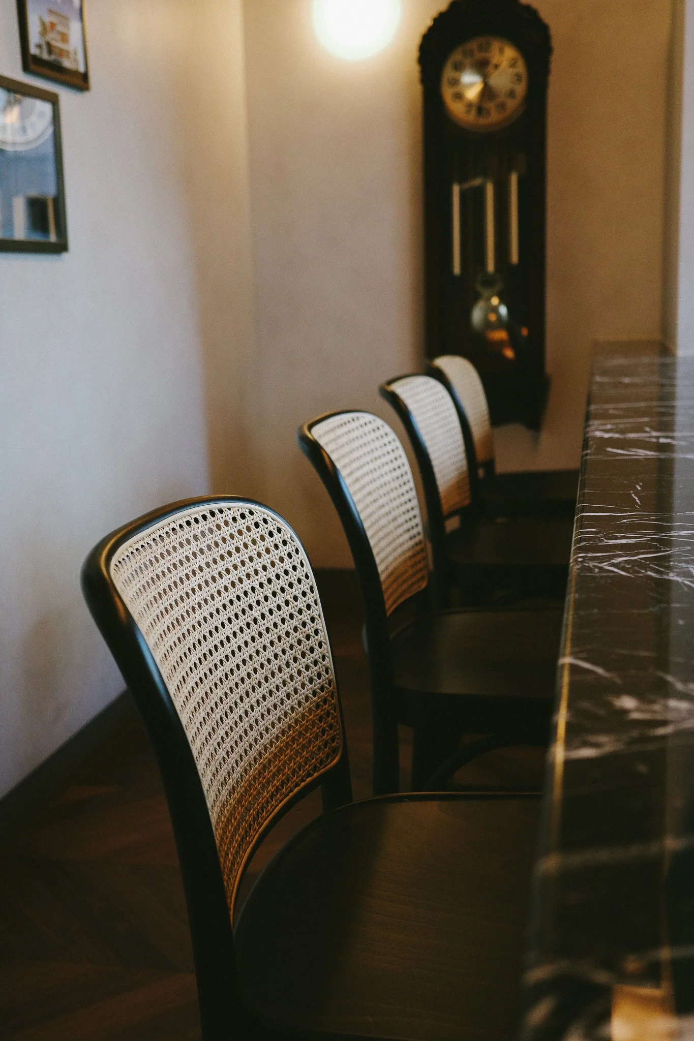
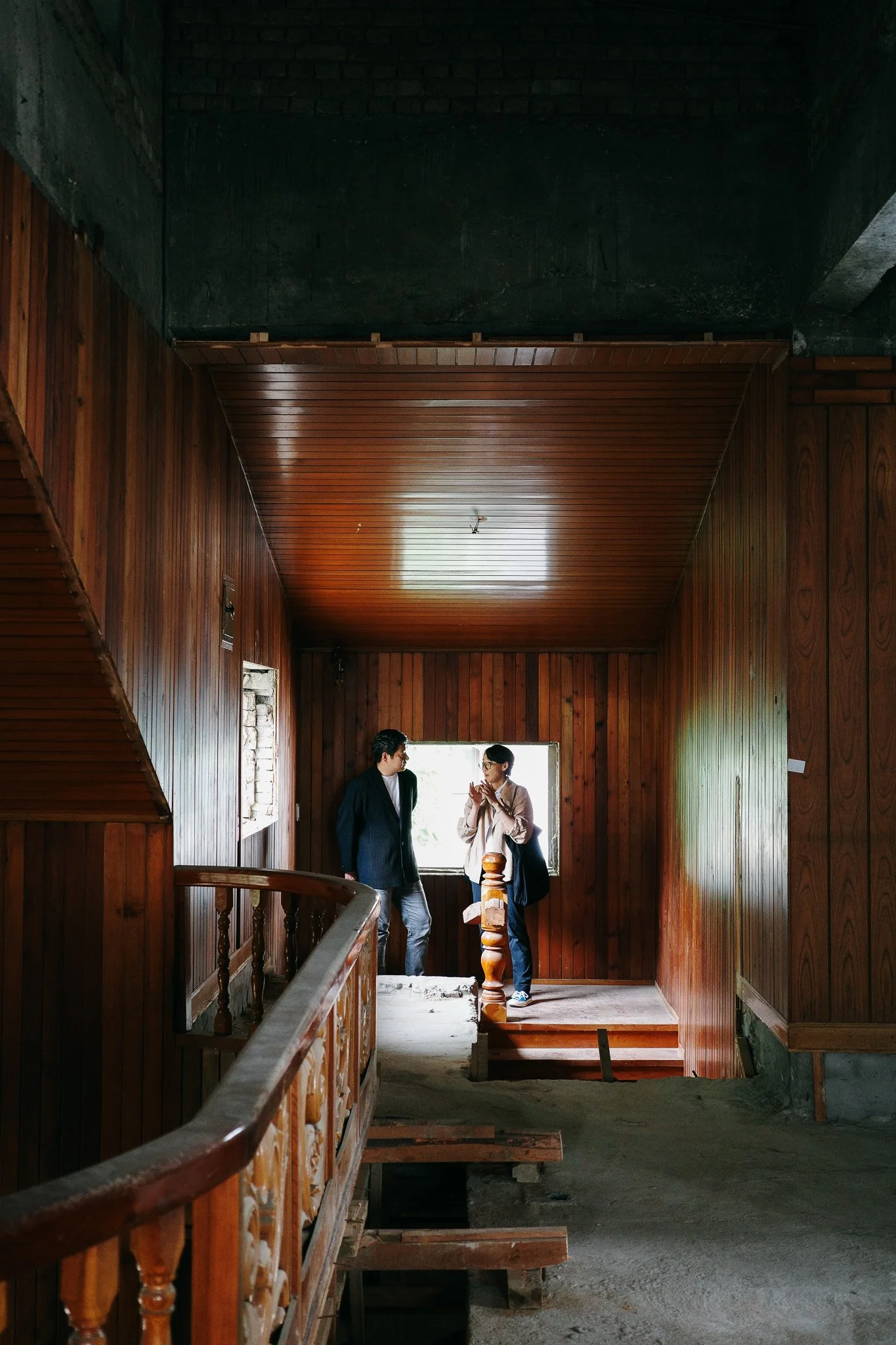
1975년 한 가족의 사적인 집을 2025년 지역사회를 위한 공적인 공간으로 레노베이션하였습니다. 3대가 살아온 이 공간에는 가족과 친인척들의 기억과 시간이 켜켜이 쌓여 있었습니다. 클라이언트의 당부는 하나였습니다. 기존의 집을 최대한 살리면서 작업해달라는 것.
-
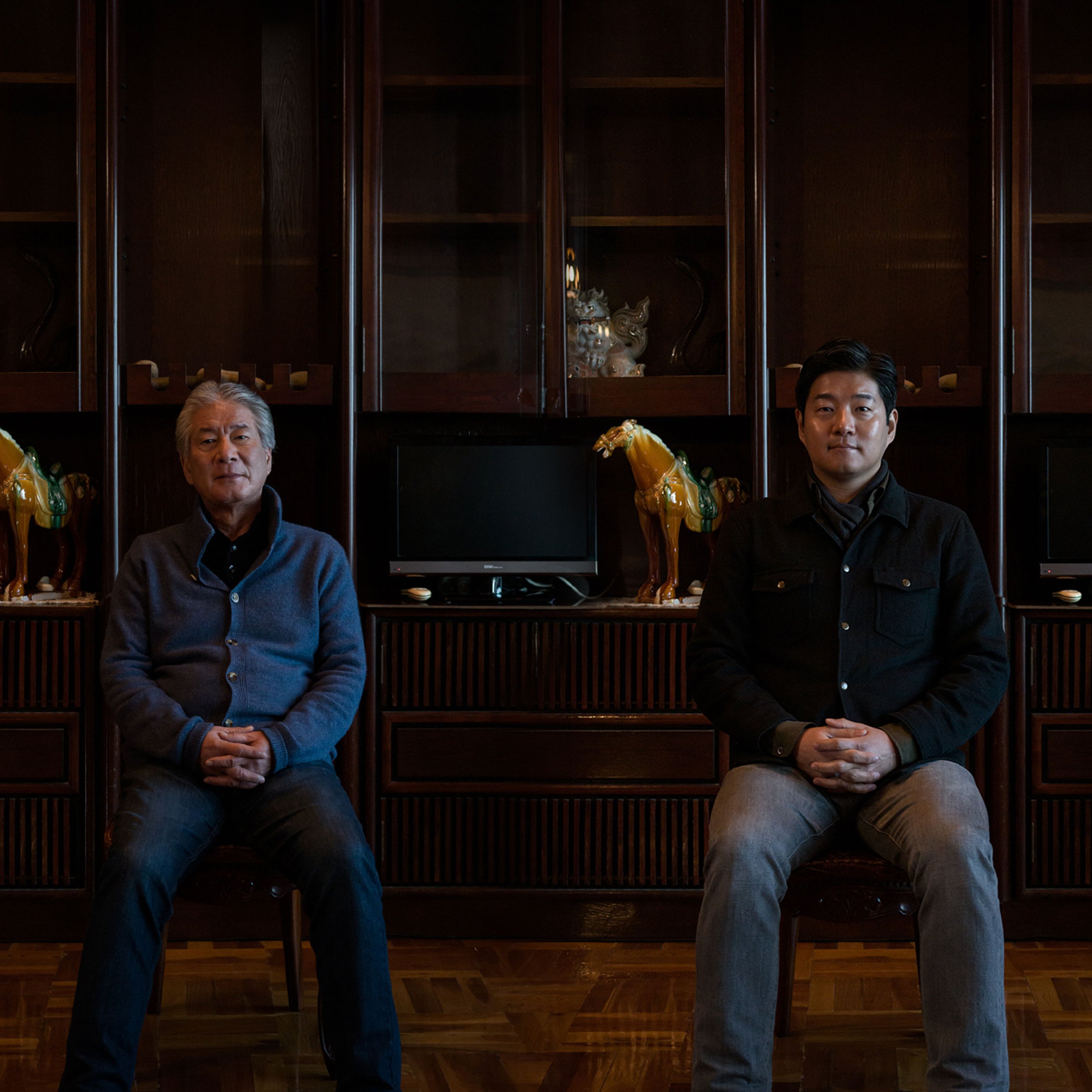
무엇을 남기고 무엇을 버릴지가 이 프로젝트의 핵심이자 가장 어려운 문제였습니다. 외부의 작업자 눈에는 가치 없어 보이는 것들이 가족에게는 소중한 장면으로 남아 있었기 때문입니다. 이 집의 기억이 우리 감각에 새겨져 있지 않은 탓에 생기는 거리감이었습니다. 우리는 그 간극을 좁히기 위해, 이 집을 기억하는 가족들을 직접 인터뷰했습니다.
-
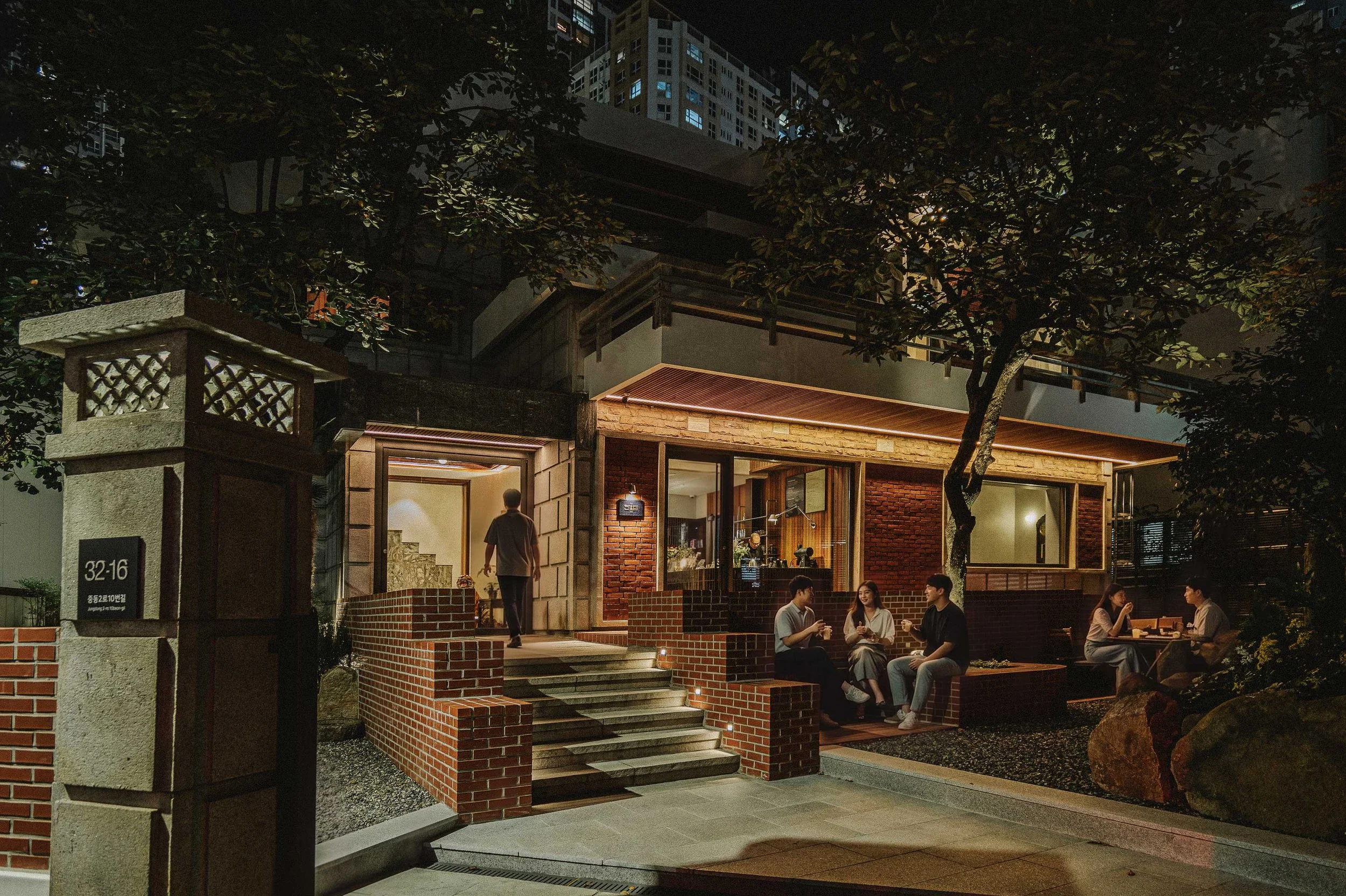
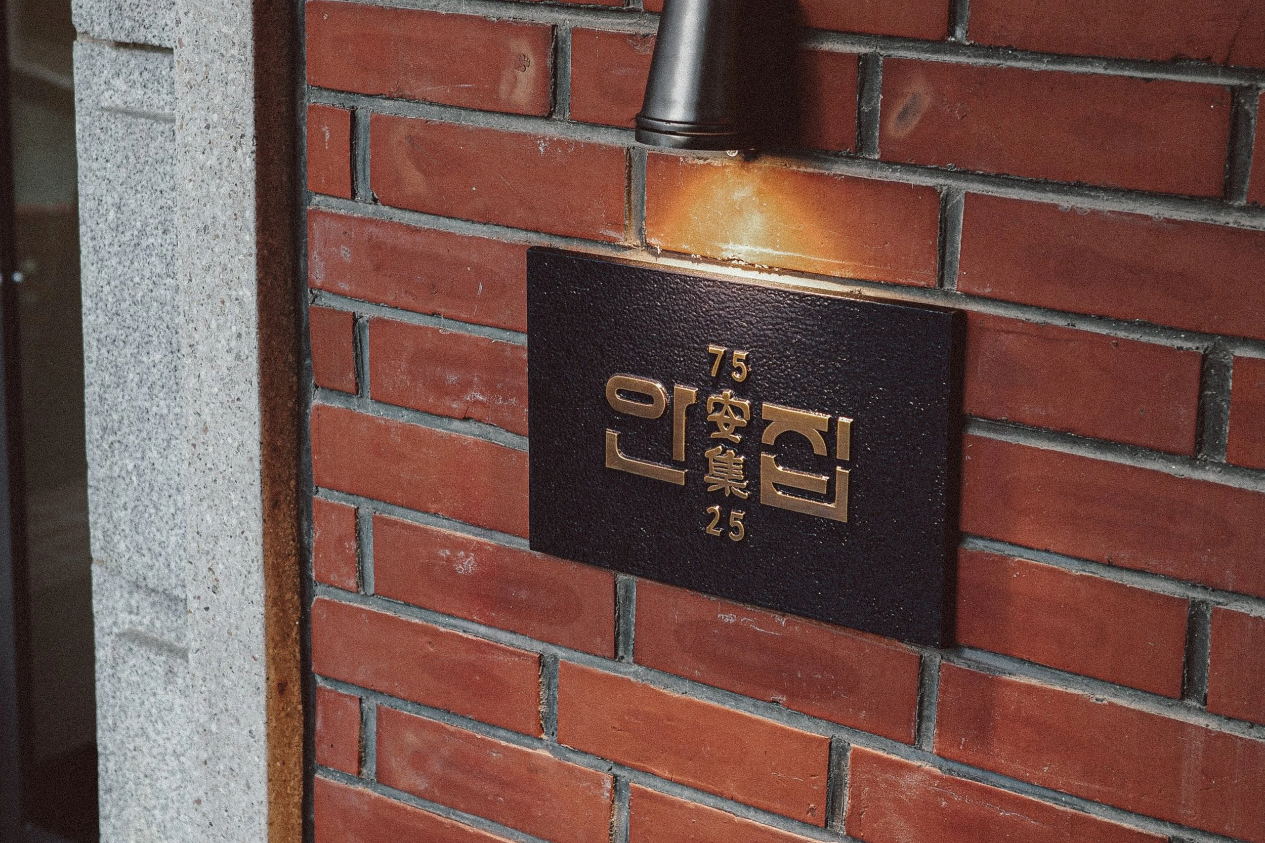
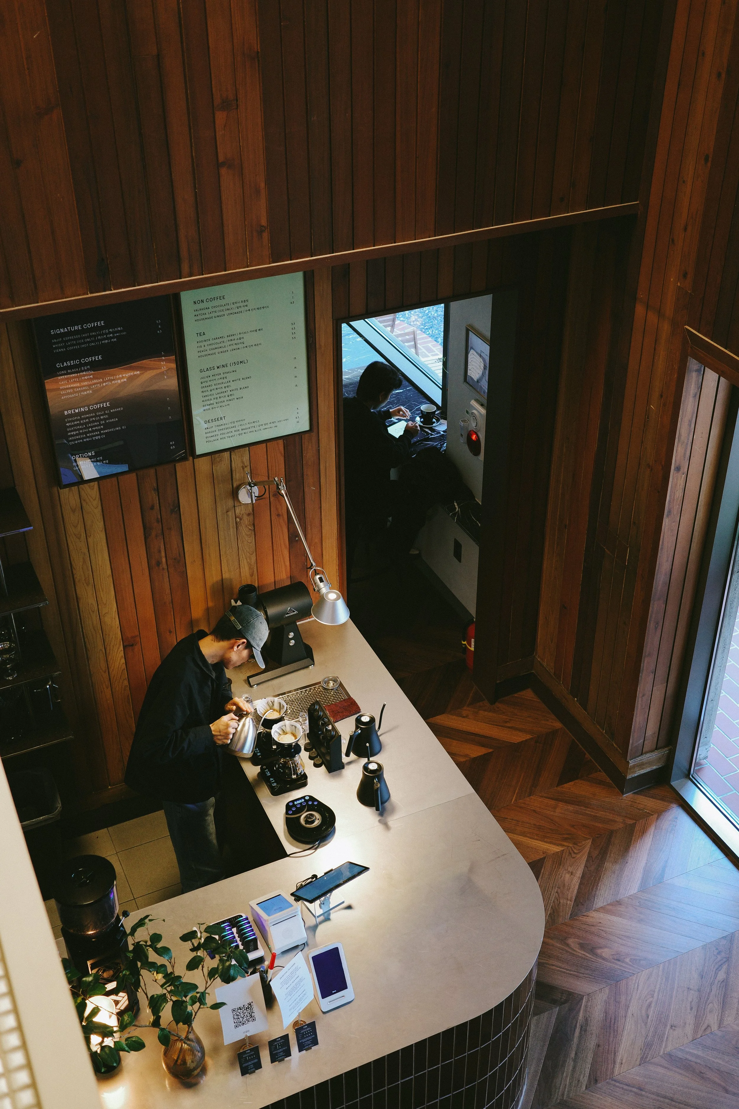
본래 가족들이 안채를 다정하게 부르던 이름인 ‘안집’은 이제 더 넓은 의미를 품고자 합니다. 우리는 이를 '편안할 안(安)'과 '모일 집(集)'으로 새롭게 정의하여, 누구나 편안하게 머물고 연결되는 열린 공간을 지향합니다. 이 변화의 중심에는 '컴포트(Comfort)'라는 키워드가 있습니다. 이는 단순한 안락함을 넘어, 어원 그대로 함께(Com) 힘을 모으고(Fort) 서로의 짐을 나누는 연대의 경험을 뜻합니다. 우리는 자연스럽게 "부산의 편안함이란 무엇인가"라는 질문을 던지며 그 답을 찾는 여정을 시작했습니다.
부산의 바람과 바다, 사람들의 정서와 삶의 리듬이 고스란히 스며 있는 곳. 안집은 '오래된 미래'이자 '새로운 과거'로서, 단순한 건축물을 넘어 함께 힘을 얻어가는 공동의 집으로 살아 숨 쉽니다. 서로에게 건네는 다정한 시선과 손길, 그리고 이 도시가 전하는 따뜻한 숨결 속에서 안집이 존재하길 바랍니다.
The Distance Between Us
What to keep and what to let go — this was both the core question and the greatest challenge of the project. Many things that appeared to have little value to outside eyes held deep meaning for the family. This was, in part, a distance that came from the simple fact that the memories of this house had never been inscribed in our senses. To close that gap, we interviewed the family members who carried those memories with them.

Imperfect
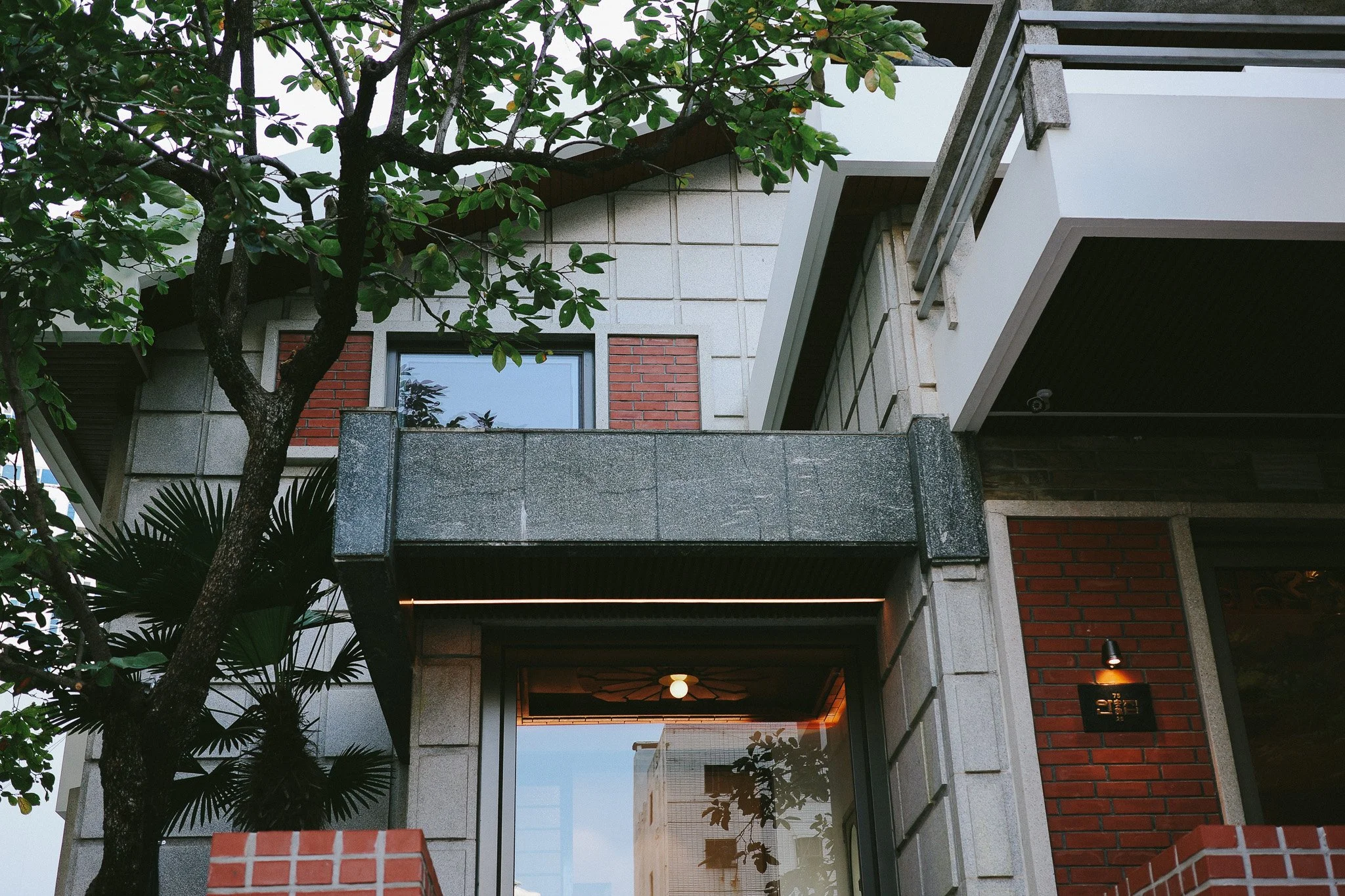
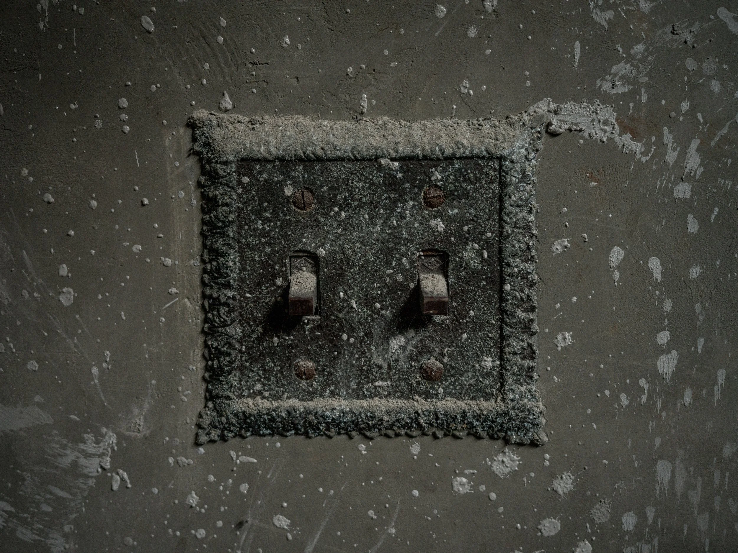
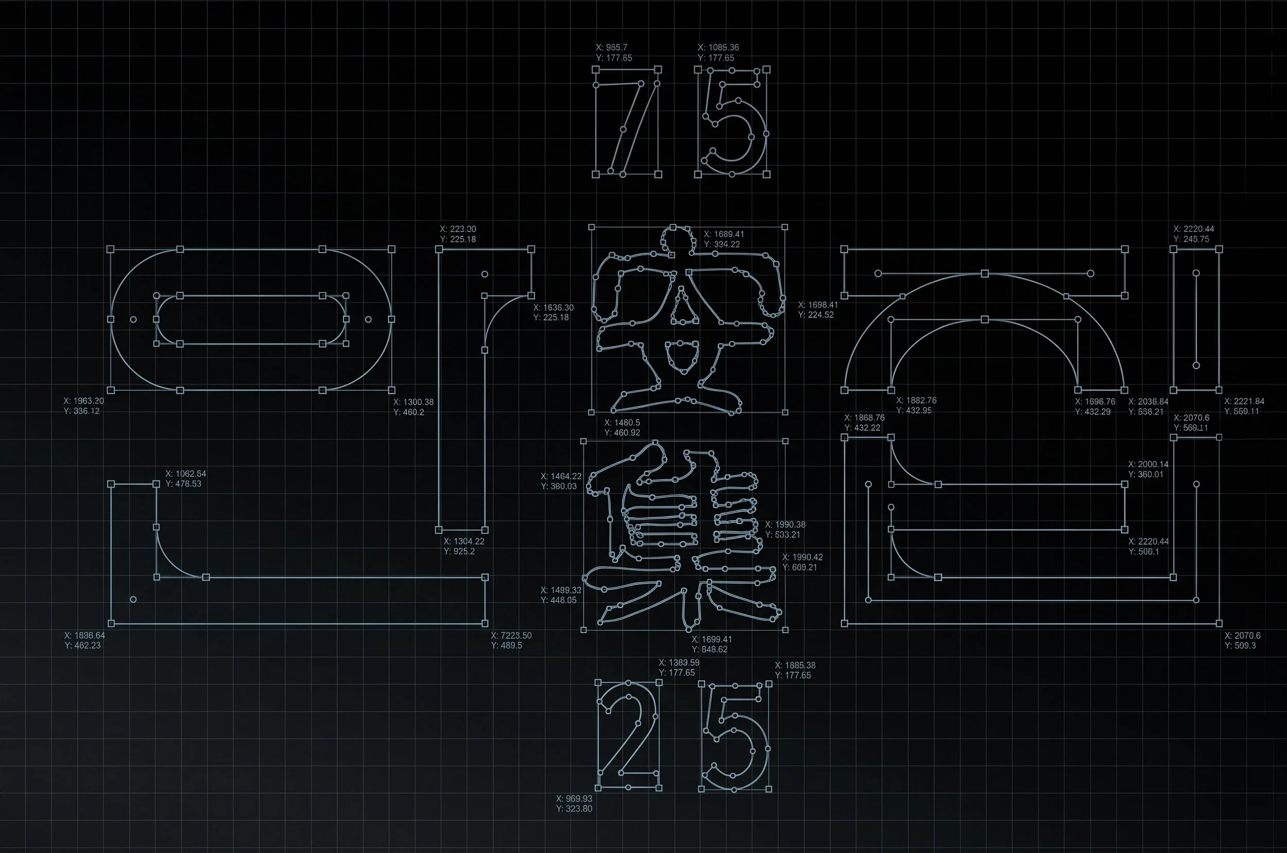
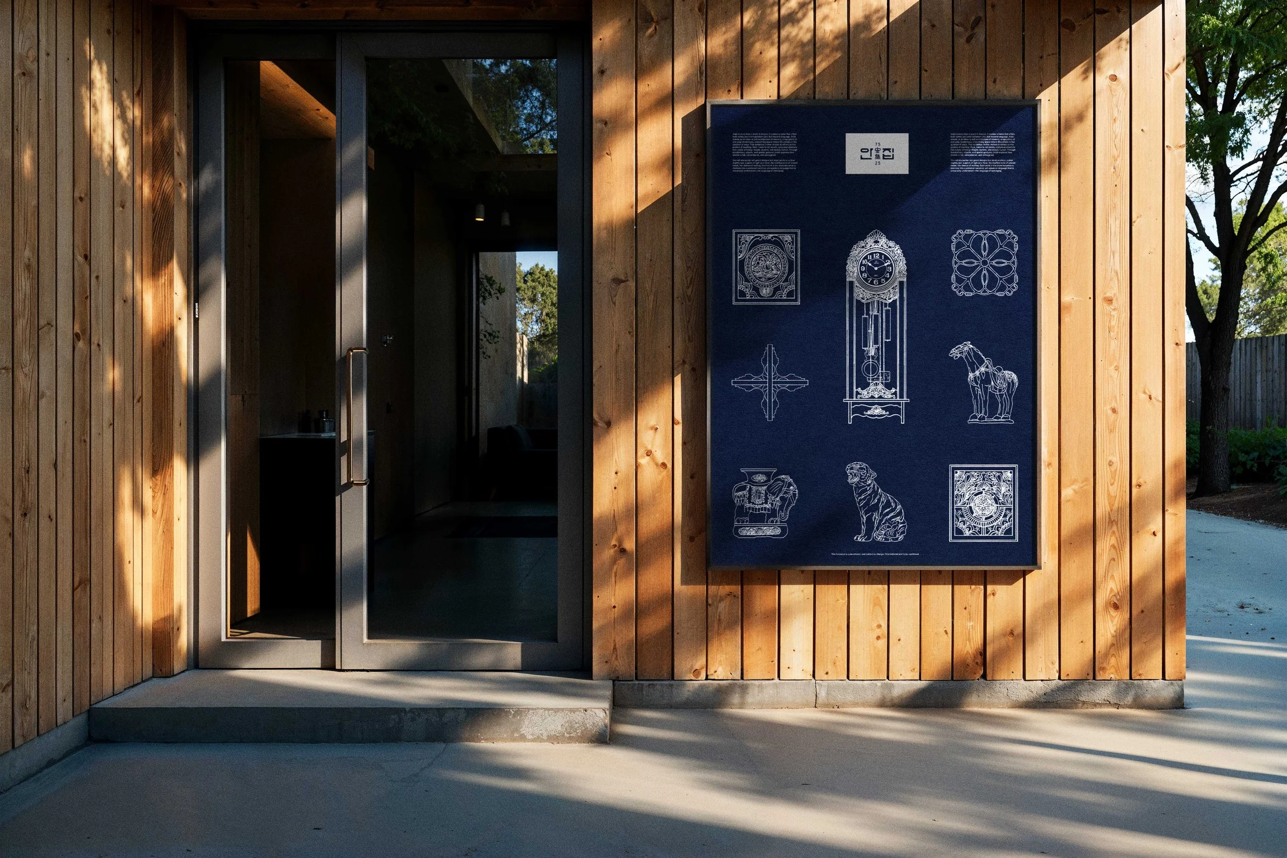
The brand design for this space began with a faded architectural blueprint from 1975. Unlike today’s fully digitized design environments, a blueprint from fifty years ago was a physical record—a time when every single line and character was carefully drawn and lettered by a human hand. Reaching us across half a century, this document presented a unique challenge: rather than pursuing a flawless, sleek aesthetic, it pushed us toward a design that embraces the imperfect yet deeply human charm of the handmade.
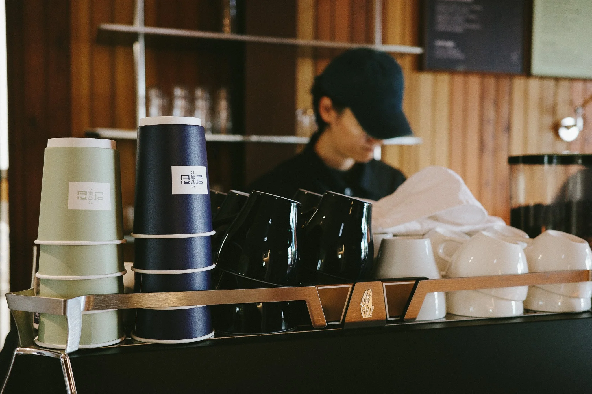
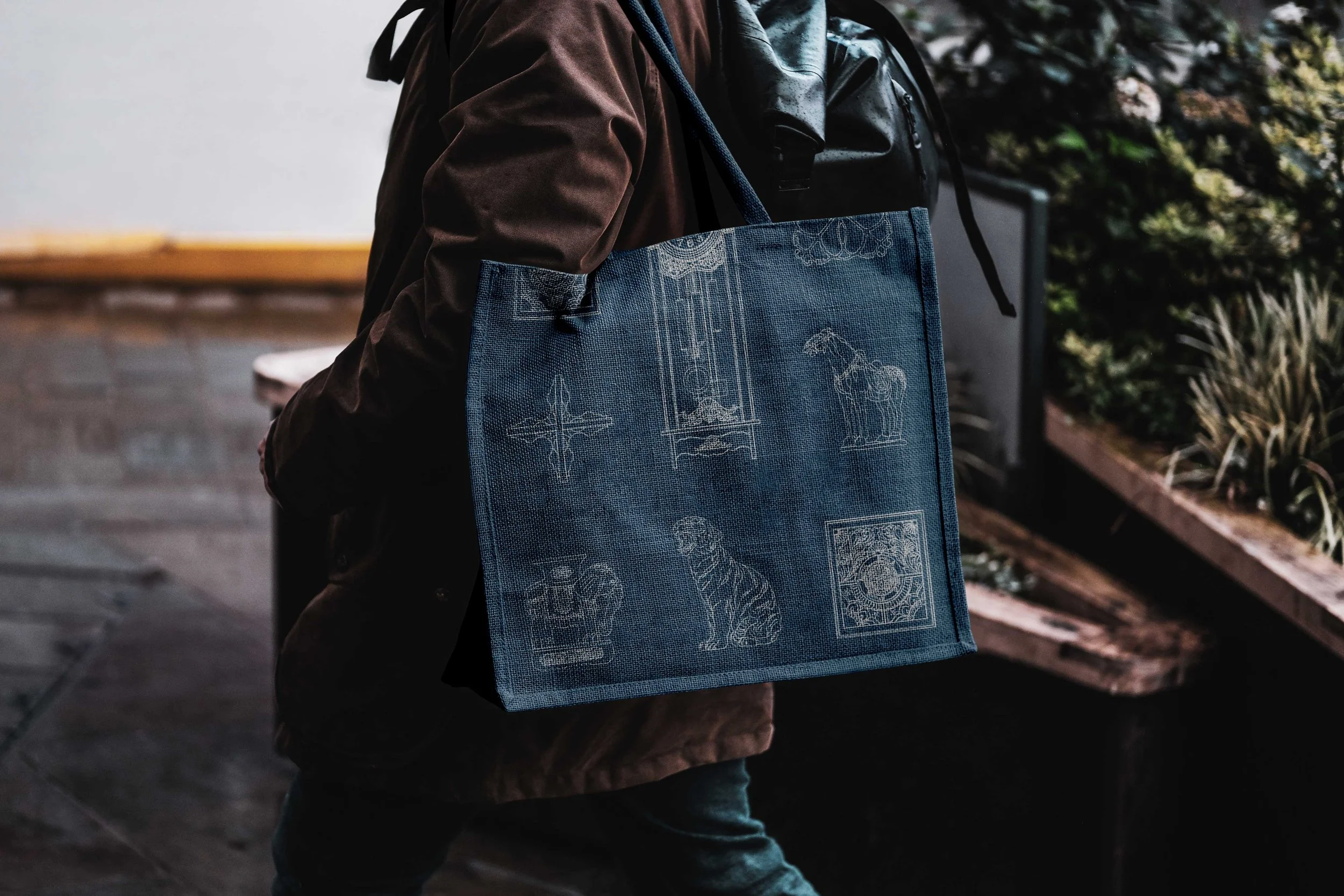
Trace by trace, we recreated the hand-lettered calligraphy found on the blueprint to develop the brand's logotype. The distinctive curves and tactile strokes discovered through this process deeply inspired the collaborating architect, ultimately weaving their way into the very fabric of the space as an architectural language. Furthermore, instead of using cold photography, we collaborated with an illustrator to capture the patterns and forms of the vintage household artifacts left inside the home through a warm, artistic gaze. Inheriting the warmth of the hand, these graphic assets have been thoughtfully integrated across various brand applications, quietly narrating the history of Anjip.
Where Comfort Grows
"Anjip" a name once affectionately used by the family to refer to the inner quarters of their home, now embraces a broader meaning. Redefined through the Hanja characters ‘An’ (安 - Comfort/Peace) and ‘Jip’ (集 - Gathering), it aspires to be an open space where anyone can find comfort and connection.
At the heart of this transformation lies the keyword ‘Comfort.’ Moving beyond mere physical relaxation, we return to its etymological roots—Com (together) and Fort (strength)—embracing it as an experience of solidarity, where we find strength together and share life’s burdens. This naturally led us to a fundamental question: "What is the true nature of Busan’s comfort?" And so, our journey to define it began.
A sanctuary where the winds and sea of Busan, along with the emotions and rhythms of its people, are deeply ingrained. Anjib lives and breathes as an 'ancient future' and a 'new past'—evolving beyond a mere physical structure into a communal home where we uplift one another. We hope you will fully experience Anjib within the gentle glances and touches exchanged here, and through the warm breath of this city.